
Let’s try to only use data from sources that are pro-covid apocalypse, to try to offset my personal bias somewhat:
USA Deaths per 1,000 people in the USA
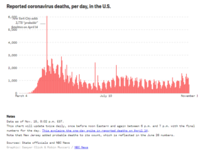
Note the data for 2020 (8.88) is a pre-covid projection – we should expect it to be higher when the real numbers come in. The question is, how much higher? According to The Conversation, which is using CDC data, in July deaths of any cause were 8-12% higher than it was projected. That was in July – should we assume that death rate continues for the rest of 2020, or did the death rate from COVID decrease over the year? Well, according to NBC, it dropped off heavily for the rest of the year, even during the fall “surge”. This shouldn’t be surprising given widespread reports from the medical establishment that the death rate is falling across all age brackets.
Notably, NYS did it’s best to spread the disease rapidly, getting most of their cases over with in the beginning of the year and mostly avoiding the 2nd season surge:
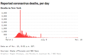
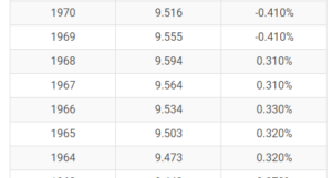
OK, so how should we estimate the percentage of increase in deaths over the whole year? Well, if you eyeball the chart, it looks like the later half of the year had about half as many Covid deaths. Let’s pick mid-range of The Conversation’s estimate of 8-12%, and say we had a 10% increase in deaths in the first half of 2020, and 5% in the 2nd half. Average that out over the whole year, and you have 7.5%. Let’s assume a grim Nov/Dec round that up to 8% for the whole year. According to the UN estimate for the USA in 2020, they were thinking we’d have 8.8 deaths per thousand. If you increase 8.8 by 8%, you get 9.5 deaths per thousand. This is a “normal” death rate when my parents were growing up. It’s only a bit higher than when I was growing up:
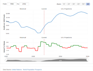
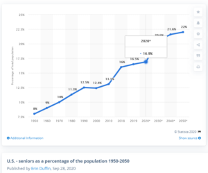
Now consider demographics. Obviously your deaths per 1,000 will be expected to be higher in a group of 1,000 elderly people than it would be in 1,000 people who are young. There has been huge increase in the ratio of people 65 years old and older since the time of our parents, see below. You’ll notice the age projections on this graph closely align with the death rate projections from the UN above.
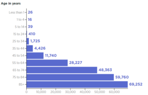
So what does this all mean? It means that with a even with an older population, and a global pandemic, folks in general no more likely to die in the USA today than they were in our parent generation. In fact, it’s only because we have such a high percentage of elderly that the death rate even manages to match the 1970’s. According to data from the CDC, (and many other sources), the vast majority of deaths have occurring in individuals over 65 years old:
Using the data provided by pro-covid apocalypse sources, it’s reasonable to believe that “the world we live in today” is actually still much safer than it was in our parents’ generation, and that disease-related fatality surges are an unavoidable consequence of having an aging population. Diseases like COVID-19, which disproportionately impact the elderly, would have had almost half the impact in the 1950’s than they have now. They likely would not have even caused a ruckus.
Right now the percentage of the population over 65 years old is at about 17%. As that number continues to climb, it means that the percentage of deaths increase for even milder illnesses will go up. If our nation has become so soft that we are no longer able to tolerate the death rate that our parents grew up with, we should keep in mind that the death rate is projected to climb much higher than it currently is over the next 50 years, even discounting pandemics. If you feel this warrants drastic changes to society, you should plan on having to make the same sacrifices from now on until the end of your life.