If you want to know why it is all Vanderleun’s fault click here.
Vanderleun made me do this
Reply

If you want to know why it is all Vanderleun’s fault click here.
All Along The Watchtower by Bob Dylan is this week’s poem of the week.
The fairness of this rant might be doubted. But it is worth noting that males do tend to mature at latter age then females. That does have some consequences worth exploring.
The Last Samurai and Europe’s First Suicide does what all good historical essays should do. It draws connections between different historical events that you would not have thought connected otherwise. But the essay would have been better off if the author had been content to make the comparison and contrast between General Maresuke Nogi and the European generals of World War I. Unfortunately, the author felt compelled to go off on rant at the end of the essay that does not fit with the rest of what he wrote.
I believe in taking responsibility for my actions. No denials, no excuses!! So here’s what I was thinking when I made the infamous cherry dress.
I’m sure you were all hoping for something much more scandalous, but no. In my own quest to better my design skills, I have attempted to read all sorts of materials on design. Mostly, they don’t say what they were thinking; they just throw out vague mumbo-jumbo that roughly translates “you just kind of wing-it, and hopefully it comes out good”. Or else they apply such strained concepts and methods that the end result is something that would be worn down the runway, which is to say, no sane human being would ever willingly, mindfully wear it.
So I may not be any great, grand designer, but I can at least show you the thought process I went through as I made this dress. You may not ever want to make anything remotely like it, and that’s okay. The idea is to be able think more consciously about what you are doing and why. This is necessary when it comes to that all important step called “editing”. You will not be able to figure out what you need to add or take away from your design if you have no idea why you ever starting making it the way you did in the first place. An idea, that is, besides the altogether much too vague statement of “Because I like it.” (Not that such a statement doesn’t have it’s uses—it does, and I use it regularly—but when one is trying to improve something, one really needs to have much more focused thought.)
So, the dress.
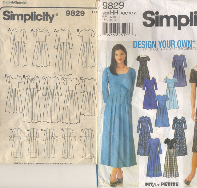
I started with this pattern (note the “start”. I wound up drafting my own pattern from scratch, to my measurements).
I liked it because it had such clean, flowing lines. It was a neat fit at the top, but with a nice full skirt. It wasn’t fussy, though it could be elegant if it were made in the proper fabric. I liked how the darts in the back of the bodice turned into pleats in the skirt; I liked that vertical structural line, because I’m doing just fine in the “short” and “wide” categories, and I think it works better with my proportions to encourage vertical movement.
Short side note: Note I say “my proportions”. I am no proponent of us all looking alike—far from it. I don’t hold to an ideal standard that all women must aspire to. But you have utterly no artistic ability at all if you can’t differentiate between proportions that are pleasing to the eye and proportions that aren’t. Some people refer to this as “phi” or the Golden Ratio. Some people have noted that children seem to have an innate sense of balance in their drawings. Some people study the shapes and proportions in nature. Architects (or the good ones, any way) are hugely concerned with proportion. To pretend that pleasing proportions is something that relates to everything the world except the human form is just plain silly.
The job of the clothes designer is not to say—this is an awful form, bring me another one, preferably a size 2 1/2, with high cheekbones. The job of the clothes designer is to trompe-l’oiel, to fool they eye. Anyone who firmly believes seeing is believing hasn’t been seeing well enough how he’s been fooled. Guiding the eye to believe what it is seeing is the job of any artist.
For a most basic example of this: grab a pen and a piece of paper, and draw a square. Don’t use a ruler, or any other measuring device. Now turn the paper sideways. Does the square still look as square? Probably not. The eye tends to squash things. You probably drew your square taller than it ought to have been. When you turned the paper sideways, this was revealed. Now that you have your paper turned, it looks a little more like a horizontal rectangle and a little less like a perfect square. You can search for geometric optical illusions, and you shall find fifty hundred other examples. The point is this: Your job is not is not to fault the form, but to simply present the form in it’s most favorable light. You can change what is seen simply by guiding the eye as you choose—leading it ignore some things, and focus on others. You can make anything look awful if you abuse it enough, and nearly anything will strike the eye if it’s presented properly.
And all of this is to say, I want to hear nothing at all along the lines of protest when I say something isn’t flattering to my proportions. This isn’t about rules, and this isn’t about standards. All this means is that you, as the designer, have the power to lead the eye. Make a conscious decision to do so.
Now, back to the dress.
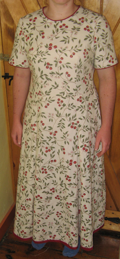
This is the fabric that I chose.
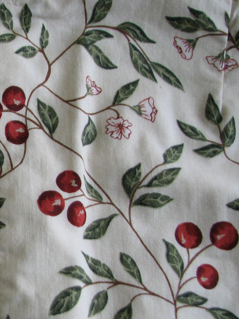
I chose it because it had my two very favorite colors in it—red and green. It reminded me of the most wonderful part of summer. It was cheerful and full of life. It was meant to be a picnic dress—the sort of dress you can wear when you are celebrating the chance to relax, and the sort of dress you can get muddy without worry.
Hear comes the first design issue. The background color of this fabric is much too similar to the tone of my skin.
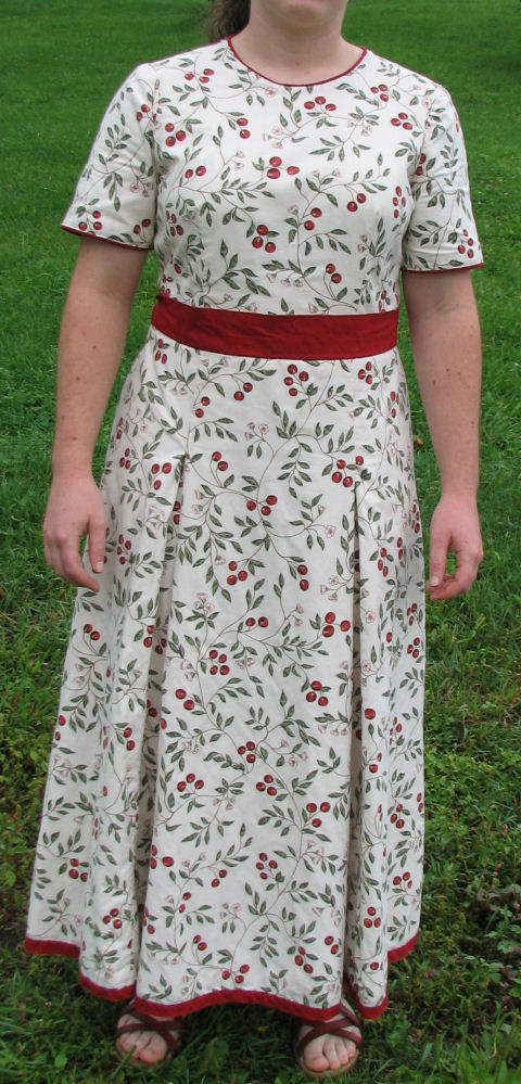
Everything needs a good strong frame. Look at paintings, look at windows, look at gates. Nothing looks so awful as something that bleeds into its surrounds, without the dignity to stand up and be proper about it. It weakens whatever it is, to have the edges fade off in a sickly sort of way. So the first order of work was to contain this fabric, so it didn’t bleed away into me. The goal of this dress is NOT to make it appear that I am wearing nothing more than a few vines with red berries on them, thank you very much. The garment is separate from me.
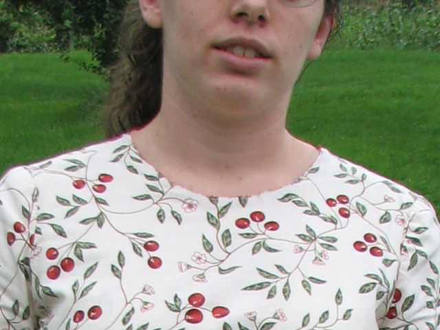
Enter the piping at the neck and sleeves. This creates a line distinguishing the dress from me.
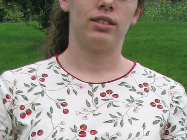
Having placed that red at the sleeves and neck, you can see why it was a necessity to put it at the bottom as well. In part to keep from having the dress fade out weakly at the bottom, but in a part because continuity demands it. The eye is very disappointed when what it expects to see is simply missing. It’s like missing a button off your shirt, when all the rest are very regularly spaced. Your eye just wants it to be there. It should be there. It’s the logical conclusion. Not putting a band on the bottom now would be like writing a story with no resolution. It would be most unsatisfying.
This is what we have now:
Do you notice any problems?
The eye is attracted to strong colors; it moves from similarities to similarities. (You’re going to be hearing a lot about the “eye”, just so you know.) The eye doesn’t have much initiative, it likes to be led. So it is dutifully following where it is being led, jumping about from cherry to cherry to cherry. But the eye is also lazy; it really doesn’t like all this running around. It wants to rest. This is utterly too much work. It would rather look away than keep moving around on this crazy surface.
And so, the waistband. It needed this solid block of color to give the eye a rest. There are those, by the way, who inform you with rigid rules and firm rebukes that you should never ever ever never ever have a belt, waistband, sash, etc unless you have a size 2 1/2 waist. Because, they say, this draws attention to the waist, and unless you have the most beautiful waist ever in existence, it’s basically a sin to wear anything that draws attention to the waist. I would maybe go so far as to caution that I think it’s generally more flattering to wear a dark, receding color, if it’s going to be at the waist like that. A bright, light color looks bigger than a dark color. If you’ve ever seen a black refrigerator, you’d know what I mean. Not that I subscribe to dark colors all the time, every where, by any means, and of course every rule or guideline is meant to be broken, but that’s my two cents.
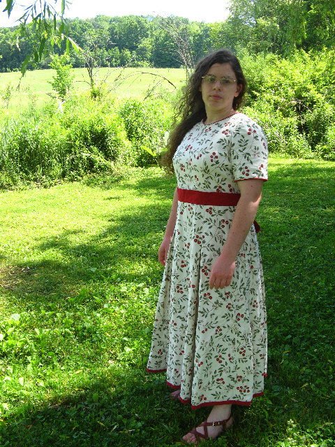
I suppose at the this point you might be disagreeing with me.
You might be saying you preferred the dress without the waistband. You might be saying that the waist band chops me half, that it totally defeats the purpose of trying to encourage a more vertical leaning of the eye. You might be saying, that darn band is the first thing that pulls your eye, and it makes you look short, short, short.
You may have a point.
I still hold that the fabric I chose demanded that treatment, but therein lies the problem. This is why you can’t just design off of ideas separate from people. This fabric, on someone else, could have been wonderful. I still love this fabric. Just, as a table cloth, or curtains, or something else besides on me. The flaw of my design was not my design, per se, just that I really had no idea what it would look like on me.
In retrospect, this fabric doesn’t suit me. Even with the solid bands of color, the eye simply does way too much moving around, and usually the more your eye has to move, the wider things appear. Since I am already short, adding in more horizontal eye movement is only making me look shorter, and my frame just can’t handle all that busy-work.
What works better for me is solid colors, like this:
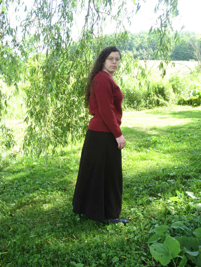
It’s not to say that I can’t use textures or details, but over all, I am more flattered by simple shapes and solid blocks of color. See?
(I made the wool skirt. I did not make the wool blend sweater, but I did accidentally send it through the dryer once. It doesn’t drape as nicely as it once did. . . )
You will note that when we compare those two pictures side by side, your eye is instinctively drawn to the the picture on the left. You will also note that as soon as the eye has looked to the left picture, it also goes immediately to my face. If you make yourself look at the photo on the right, you will notice that your eye does indeed get stuck on the red sash. For one thing, it is the largest solid block of color. Your eye wants to rest, and that’s a good place. For another thing, my face is still basically the same color as the background of the dress. It fades away into the background. When I wear the cherry dress, your eye is not instantly pulled to my face. It forgets about my face and pays attention to the dress. This is a problem. Well designed clothes do not draw attention to themselves, they draw the attention the the wearer.
The outfit on the left understands this; it grabs your attention with its large blocks of strong colors, and then promptly shoves all the attention to my face. The dress on the right doesn’t understand this, or else is simply being willfully selfish, because it isn’t interested in sharing any of the attention. Your eye can get distracted jumping from cherry to cherry to cherry for a good five minutes, but it your eye is extremely unlikely to be interested in paying attention to my face. (This is most obvious in a still photograph. In real life, the eye is attracted to movement, and as I’m nearly always running my mouth off, that would give my face a chance to be noticed. Or my mouth, at any rate.)
Does this mean that the pattern draft was a waste, and that I should burn it and never look back? No! I would still like to make the “cherry dress” pattern again—just, with a few modifications and a solid color of wool crepe. The lessons here to be learned are:
(1) Good fabric stores ought to have full length mirrors in them, so you can better approximate how a fabric will look on you, and
(2) You can’t design clothing apart from the people who will be wearing them. The idea might sound perfectly grand on paper, but in real life is where it counts. On paper, this dress might sound wonderful, but in real life, I feel uncomfortable and awkward wearing this dress. Because I worked from ideals without seeing how it would work in reality, I failed to meet my ideals that I started with.
At least 30 people were killed or reported missing and about 180,000 homes destroyed in a powerful earthquake in southwest China, state media said Sunday.
More than 360 people were injured in Saturday’s 6.1-magnitude earthquake, which rocked Sichuan and Yunnan provinces, the official Xinhua news agency reported, citing the civil affairs ministry.
Granted this is not as big as last time. And 180,000 homes destroyed is not much in a country with over a billion people in it. But a couple of more earthquakes and and China’s construction industry is going to have a hard time keeping up with the rebuilding and the demands of China’s growing economy.
From Businesses Week (h/t Calculated Risk)….
A decision not to make the interest payment would place the county in default and put it one step closer to filing bankruptcy over a $3.2 billion bill linked to years of court-ordered sewer improvements and risky credit arrangements.
Such a move would nearly double the previous record for a municipal bankruptcy, set in 1994 when Orange County, Calif., sought protection over $1.64 billion in debts.
And why did Jefferson County take on such a large debt?
Jefferson County got into trouble after it was forced by the courts to undertake a huge upgrade of its sewage system to meet federal water standards and stop raw and partially treated waste from being dumped into streams.
Acting at the suggestion of outside advisers, the county borrowed money for the project on the bond market in a complex and risky series of transactions. When the mortgage crisis hit and banks began tightening up on their lending, the interest rates on the debt ballooned.
The nearly completed sewer project has been under construction since 1996.
It looks like New Orleans may get hit by a major hurricane again. On the plus side, the majority of the oil rigs may be missed. Oil Drum has constant up dates.
Edit: More from Calculated Risk…..
We’re already seeing gas prices get hit. Shell Oil said it will pull all workers off platforms, along with nearly every other producer. More importantly, the Louisiana Offshore Oil Port will halt taking crude this weekend; it’s the only deepwater oil port in the nation.
Nuts.